How are we feeling 2021-2022 1st edition
Topics
During the most recent NBA off season, I was playing around with data to see how I could measure and visualize a team’s performance relative to expectations.
I ultimately decided to just use a Las Vegas over/under since I thought it would encompass some level of expert expectations as well as having public perception was baked in. You can read all about it and see my code at my earlier post.
I figured now that we are about a quarter of the way through the 2021-2022 season, it would be a good time to check in and see which teams are over and under performing against expectations.
Here is a quick summary of my thinking from the last time I did this:
I took each team’s over/under and translated that to a win percentage for the year. Then I pulled each team’s win percentage after every game and compared the two numbers. If the win percentage was higher, I thought a fan base would be happy.
You’ll notice that I did not account for strength of opponent, home vs away, injuries, or any other of the normal adjustments a good analysis would incorporate. That’s because I was trying to get at how a casual fan (whatever that means) might be feeling about their team. So for instance, if team went on a 4 game win streak, I don’t think a casual fan would think to look at all the details, they would just see the W-L record and have a gut feeling.
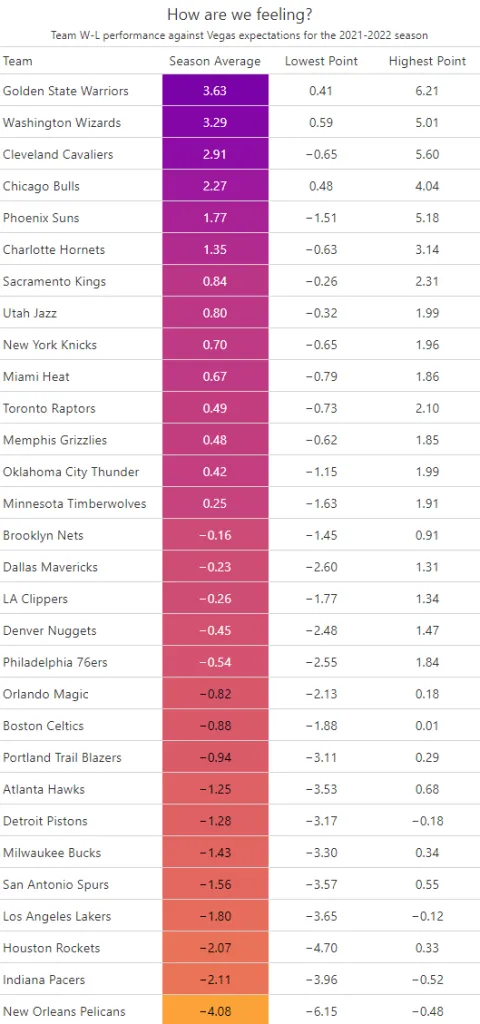
This year’s table so far shouldn’t be very surprising to anyone who’s been following the Association.

library(ggplot2)

leadsLogic |>
    filter(str_detect(product, "salary")) |>
    #filter(formDate < as.Date("2024-05-01")) |>
    #filter(InquiryType == 'New') |>
    group_by(
        formMonth,
       # product,
        InquiryType
        ) |>
    summarize(count = n()) |>
    ggplot() +
    geom_line(aes(x = formMonth, y = count, group = InquiryType, color = InquiryType)) +
    themeMatt() +
     scale_y_continuous(labels = scales::comma, limits = c(0, NA), expand = expansion(mult = c(0, 0.1))) +
        scale_x_date(
            date_breaks = "months",
            labels = scales::label_date_short(),
            expand = c(.01, 0)
        )
As someone who lives in Chicago, roots for the Pacers, and loves watching the Warriors, I’d say this all tracks.
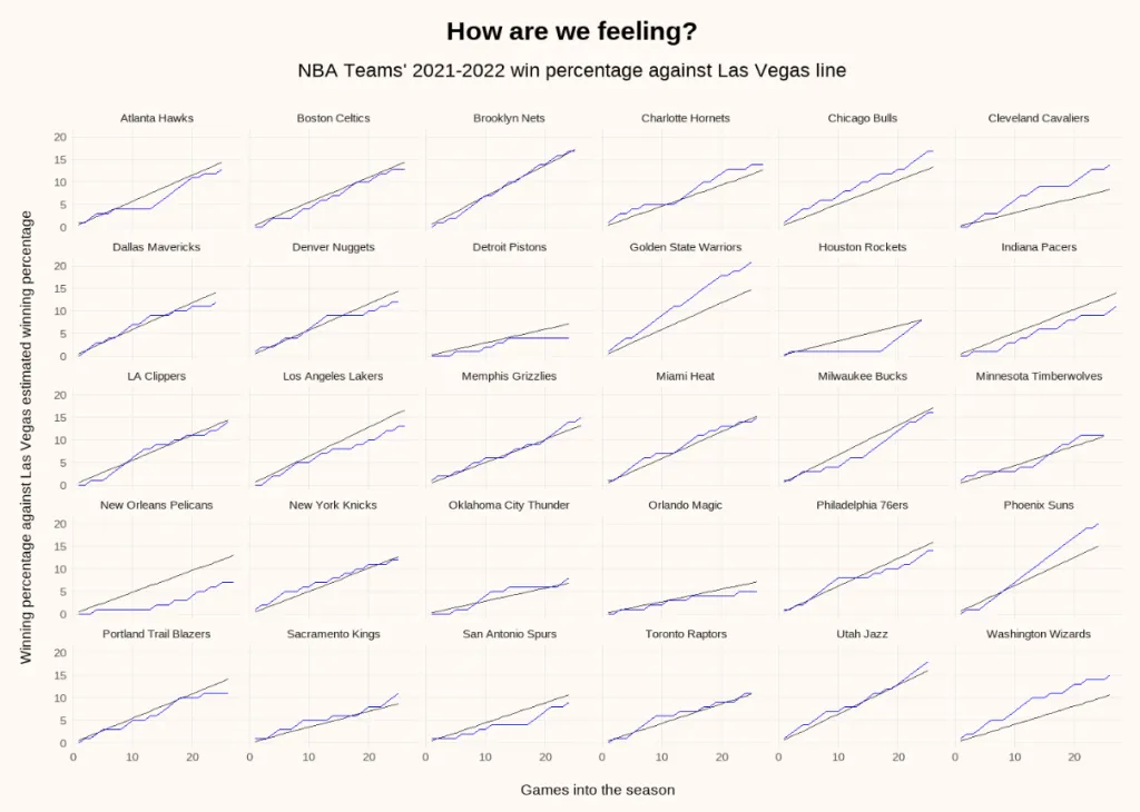
I also plotted the data above in a couple of ways. First, as a a faceted chart with a line for the Las Vegas win percentage in black and actual performance in blue. It’s still hard to read but I do like that you can look at the slope of the black line to see expectations.

Test #
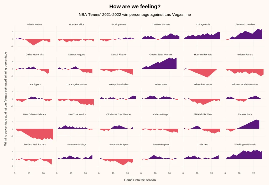
Finally, I’ve flattened the expectations line and measured how far above or below the expected win percentage each team is after every game they’ve played so far.

A couple of things that jump out to me are:
- Houston climbing back to expectations with their recent win streak
- Dallas slipping a bit recently while the bucks started to climb back with a healthier team
- The fact that I can tell myself ‘at least you aren’t a Pelicans fan’
I hope you find this mildly interesting. If so, or if you have other thoughts, let me know.