How are we feeling? Measuring the perception of NBA team performance (2020 edition)
Topics
As the NBA season starts up again, I was thinking about how to quickly measure a team’s perceived performance as the year goes on. For instance, I could look at all the advanced stats, choose the ones I think best represent performance, and really dig in.
Or, I could pull a bunch of NBA tweets and analyze text sentiment by fan base over time.
But for this I just wanted something quick and dirty.
Choosing a projection #
With all the preseason projections coming out for every site under the sun, I thought about which one I should compare actual performance to. Ultimately, I decided to use a Las Vegas book’s over/under, not because I thought it would be the most accurate, but rather because it would have public perception baked into it. For example, a fan base may be unreasonably high on their team’s chances this season. Vegas then, in theory, could inflate the win total number to capture that excitement and take advantage of it.
Examining the 2020-2021 season #
Since we are about three games into the 2021-2022 season, I wanted to look at last season’s numbers to see if this was an interesting exercise and something that I should check in on as this year gets going.
I took each team’s over/under and translated that to a win percentage for the year. Then I pulled each team’s win percentage after every game and compared the two numbers. If the win percentage was higher, I thought a fan base would be happy.
You’ll notice that I did not account for strength of opponent, home vs away, injuries, or any other of the normal adjustments a good analysis would incorporate. That’s because I was trying to get at how a casual fan (whatever that means) might be feeling about their team. So for instance, if team went on a 4 game win streak, I don’t think a casual fan would think to look at all the details, they would just see the W-L record and have a gut feeling.
To the code! #
I used the nbastatR package to pull team’s results from last season and manually entered over/under totals from VegasInsier.com.
library(tidyverse)
library(nbastatR)
library(gt)
library(viridis)
library(showtext)

log <- game_logs(
  seasons = 2021,
  league = "NBA",
  result_types = "team",
  season_types = "Regular Season",
  nest_data = T,
  dataTables = c(numberGameTeamSeason, nameTeam, outcomeGame, isWin),
  assign_to_environment = TRUE,
  return_message = TRUE
)

log %>%
  select(nameTeam, slugTeam, numberGameTeamSeason, idTeam, outcomeGame, isWin, urlTeamSeasonLogo)

team_info <-
  log %>%
  select(nameTeam, slugTeam, idTeam, urlTeamSeasonLogo) %>%
  distinct()

game_info <-
  log %>%
    select(slugTeam, idTeam, numberGameTeamSeason, outcomeGame, isWin)

clean_game_info <-
  game_info %>%
  group_by(slugTeam) %>%
  mutate(wins =
           case_when(
             outcomeGame == "W" ~ 1,
             TRUE ~ 0),
         winTotal = cumsum(wins),
         winPercent = winTotal/numberGameTeamSeason
           ) %>%
  arrange(slugTeam)
  #filter(numberGameTeamSeason < 10) #Test if it works part way through a season

# Lines taken from https://www.vegasinsider.com/nba/odds/win-totals/

lines_teams = c(
  "Atlanta Hawks",
  "Boston Celtics",
  "Brooklyn Nets",
  "Charlotte Hornets",
  "Chicago Bulls",
  "Cleveland Cavaliers",
  "Dallas Mavericks",
  "Denver Nuggets",
  "Detroit Pistons",
  "Golden State Warriors",
  "Houston Rockets",
  "Indiana Pacers",
  "LA Clippers",
  "Los Angeles Lakers",
  "Memphis Grizzlies",
  "Miami Heat",
  "Milwaukee Bucks",
  "Minnesota Timberwolves",
  "New Orleans Pelicans",
  "New York Knicks",
  "Oklahoma City Thunder",
  "Orlando Magic",
  "Philadelphia 76ers",
  "Phoenix Suns",
  "Portland Trail Blazers",
  "San Antonio Spurs",
  "Sacramento Kings",
  "Toronto Raptors",
  "Utah Jazz",
  "Washington Wizards"
)

lines_over <- c(
  47.5,
  45.5,
  56.5,
  38.5,
  42.5,
  26.5,
  48.5,
  47.5,
  24.5,
  48.5,
  27.5,
  42.5,
  45.5,
  52.5,
  41.5,
  48.5,
  54.5,
  35.5,
  39.5,
  41.5,
  23.5,
  22.5,
  50.5,
  51.5,
  44.5,
  28.5,
  36.5,
  35.5,
  52.5,
  33.5
)

clean_lines <-
  cbind(lines_teams, lines_over) %>%
    as.data.frame() %>%
    rename(Team = lines_teams,
           Over = lines_over) %>%
    mutate(Over = as.numeric(Over)) %>%
  left_join(team_info, by = c("Team" = "nameTeam"))

all_games <-
  crossing(clean_lines$Team, c(1:82)) %>%
  rename(Team = `clean_lines$Team`,
         numberGameTeamSeason = `c(1:82)`)

expectedWins <-
  clean_lines %>%
    select(-c(urlTeamSeasonLogo)) %>%
    mutate(winPer = Over/82) %>%
    left_join(all_games) %>%
    mutate(expectedWins = winPer * numberGameTeamSeason)

finalTable <-
  clean_game_info %>%
    left_join(expectedWins) %>%
    mutate(performance = winTotal - expectedWins) %>%
    group_by(Team) %>%
    mutate(avgPerformance = mean(performance),
           minPerformance = min(performance),
           maxPerformacne = max(performance)) %>%
    arrange(avgPerformance)
Charting it out #
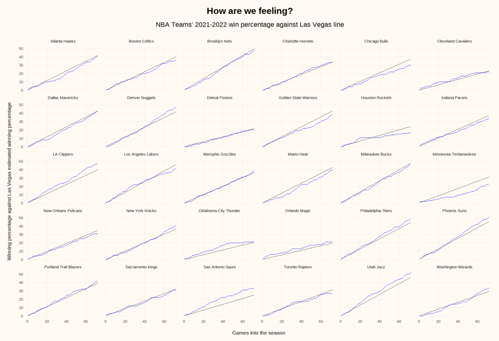
Next, I threw together a quick faceted chart with a line for the Las Vegas win percentage in black and actual performance in blue.
finalTable %>%
  ggplot() +
  geom_line(aes(x=numberGameTeamSeason, y=expectedWins), color =  "gray20") +
  geom_line(aes(x=numberGameTeamSeason, y=winTotal), color = "blue") +
  facet_wrap(~ Team) +
  theme_matt() +
    labs(title = "How are we feeling?",
       subtitle = "NBA Teams' 2021-2022 win percentage against Las Vegas line",
       x = "Games into the season",
       y = "Winning percentage against Las Vegas estimated winning percentage")
This chart is hard to parse, but what I do like is you can see the relative expectations for each team by scanning the slope of the black line. (For instance, look at Detroit compared to Golden State.)
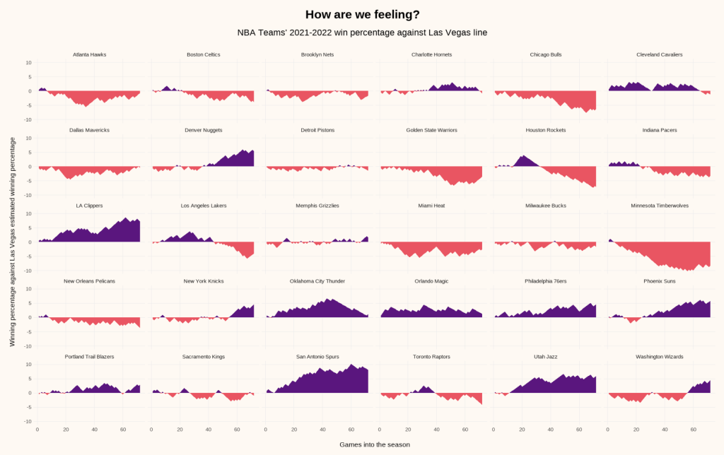
A better view in my opinion is this one, which flattens the black expectation line into the x-axis and just looks at relative performance.
finalTable %>%
  ggplot() +
  geom_area(aes(x=numberGameTeamSeason, y=ifelse(performance<0, performance,0)), fill=viridis(12, option = "A", direction = -1)[5]) +
  geom_area(aes(x=numberGameTeamSeason, y=ifelse(performance>0, performance, 0)), fill=viridis(12, option = "A", direction = -1)[9]) +
  #geom_hline(aes(yintercept = 0)) +
  facet_wrap(~Team) +
  theme_matt() +
  labs(title = "How are we feeling?",
       subtitle = "NBA Teams' 2021-2022 win percentage against Las Vegas line",
       x = "Games into the season",
       y = "Winning percentage against Las Vegas estimated winning percentage")
Here you can see:
- When the Laker’s season took a turn
- Why it remains terrible being a Minnesota Timberwolves fan
- Why the Knicks felt great headed into the post season
- What this chart doesn’t capture is that Rockets fans were probably delighted as their win percentage slipped further and further down, increasing their lottery odds.
In summary #
Is this perfect? No. Is it interesting? Kind of!